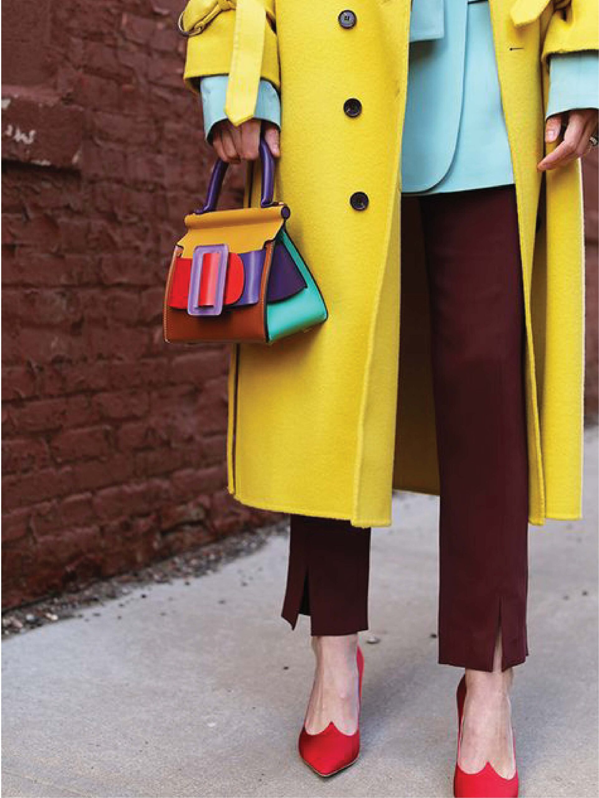
2021 is here and I am so excited! Are you wondering why certain colours are commonly found between fashion outlets or interior design these days? Yeap, because Pantone Color of the Year is a colour trend forecast for the consumer, which means the shirts you buy, or the paint available in the market, even wedding theme colour or accessories can include most of the colour I am about to show you. In this article, I am giving examples how you can match and style these 15 colours. At the same time I will categorize these colours into warm categories & cold categories so it makes sense to most of you why certain colours look good on you and certain colours drain you. From here, you can identify which category you are in, or perhaps you suit both categories.
Pantone chose these 15 colours inspired by The Beauty of Nature Supports Flexibility and Reinvention. According to Leatrice Eiseman (Pantone, 2020), Executive Director of the Pantone Color Institute said:” Offering a range of shades illustrative of nature, Spring/Summer 2021 colours underscores our desire for flexible color that works year-round. Infused with a genuine authenticity that continues to be increasingly important, Spring/Summer 2021 colours combine a level of comfort and relaxation with sparks of energy that encourage and uplift our moods.” Below is the Spring/ Summer 2021 New York Colour Palette that inspires ingenuity and inventiveness from the shades of nature coupled with some new core classics shades.
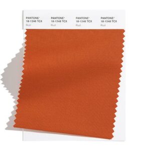
Rust
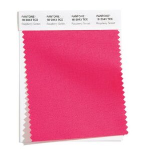
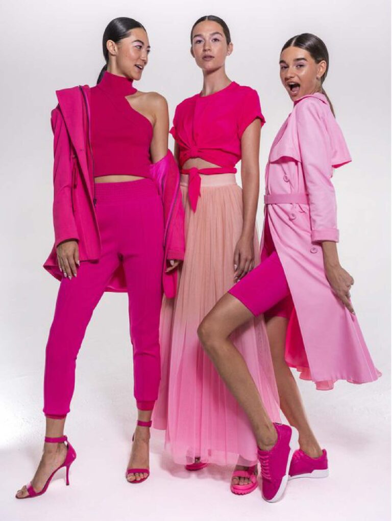
Raspberry Sorbet
Illuminating
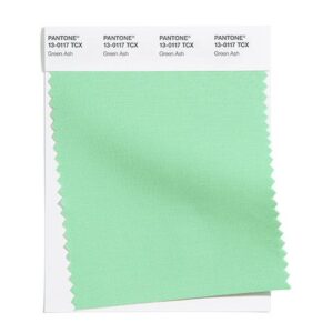
Green Ash
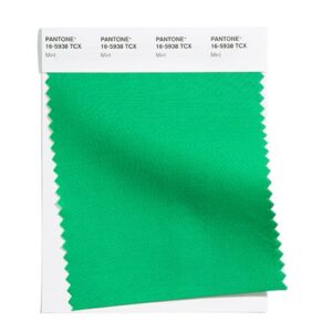
Mint
Marigold
Amethyst Orchid
Burnt Coral
Cerulean
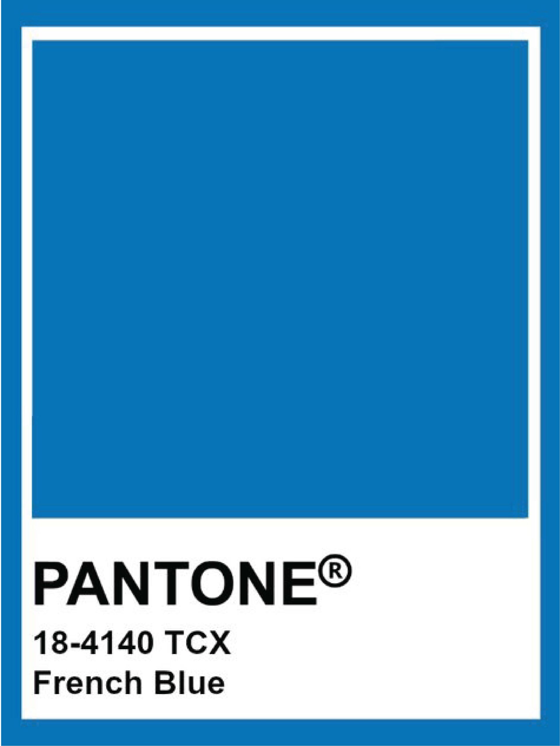
French Blue
Marigold
1
2
3
4
5
6
Previous
Next
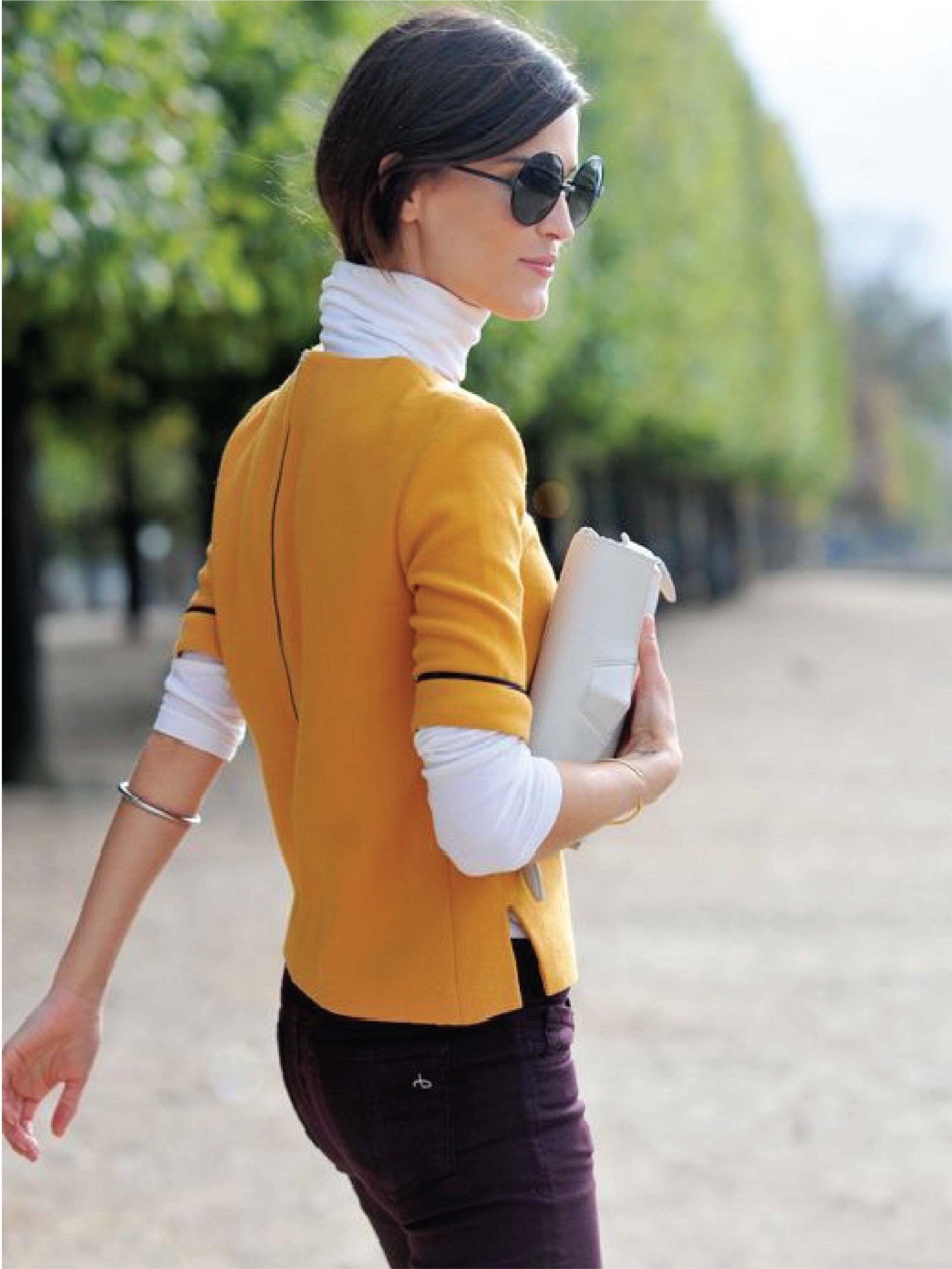
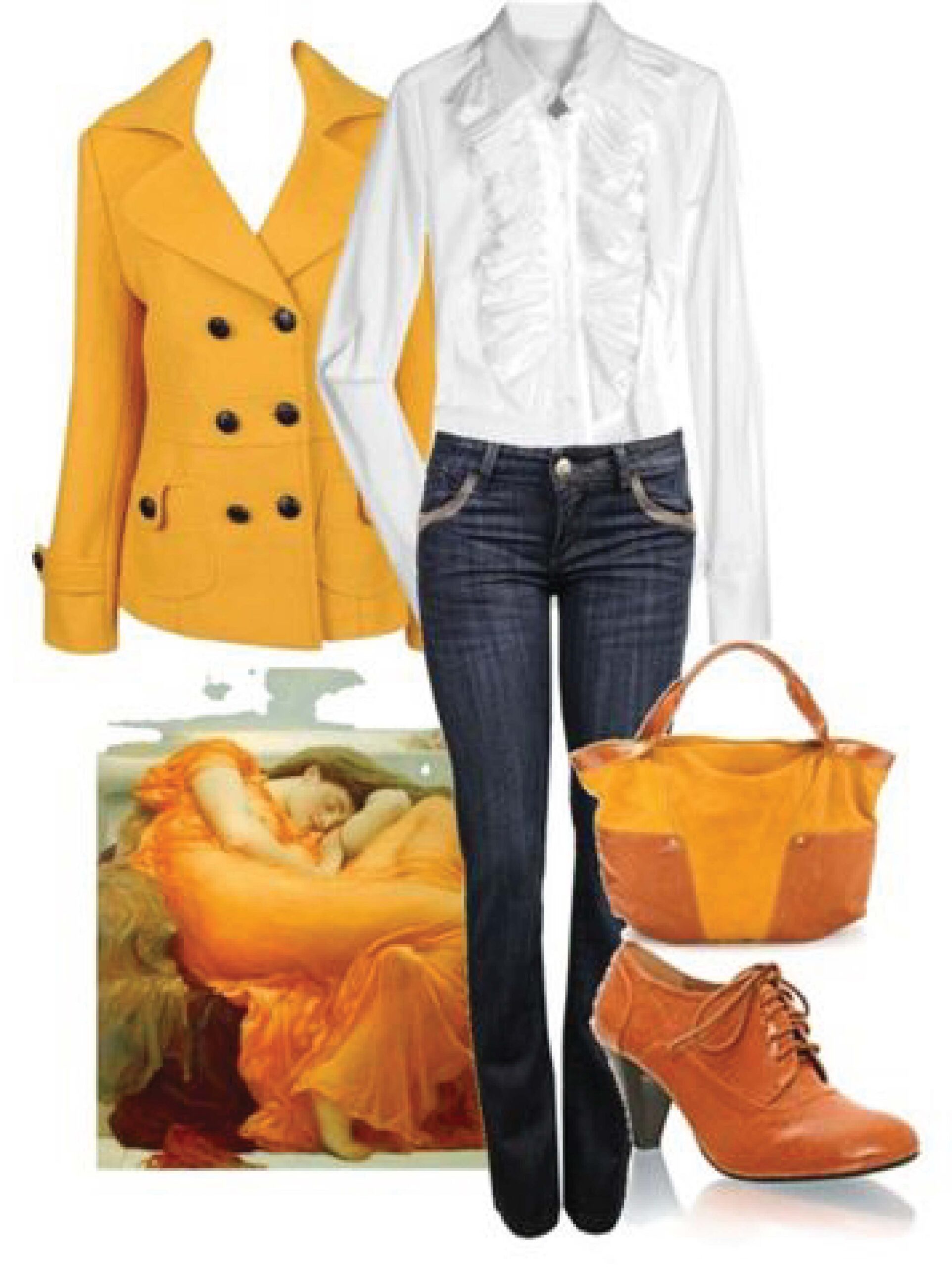
The first colour is Marigold. Looking at this colour we can immediately feel the cheerfulness and peace. According to Pantone (2020), Marigold is a comforting golden orange infused yellow lends a warming presence.
(Pic 1 - 4)
If you belong to the warmer tone family, Congrats! You can wear this colour on the top, the whole suit, or pair up this beautiful colour accessories close to your face to look glowing, radiant. For colour combination wise, pair it with black, navy blue, grey or white would never go wrong. If you want to try something exciting, pomegranate colour it is!
(Pic 5 - 6)
However, if you are unsure how this colour works for you, keep it away from your face to avoid dullness and tiredness. You can apply this colour on your pants, shoes, or even bags. For Muslimah who belong to a cooler tone family, avoid this colour as your headscarf.
Cerulean
1
2
5
6
7
Previous
Next
Wearing the colour of Cerulean gives the tranquility and relaxation effect. This lighter shade of blue takes up a large part of nature like the sea and the sky. It gives clarity and helps smoothen the conversation with a stranger or closed ones.
If you really like this colour but it does not make you look that great, no worries! The purpose of this article is to give you examples so you can still shop this colour but style it differently. For example, apply a warm colour scarf over a cerulean colour top or put on a warm orange top with cerulean pants.
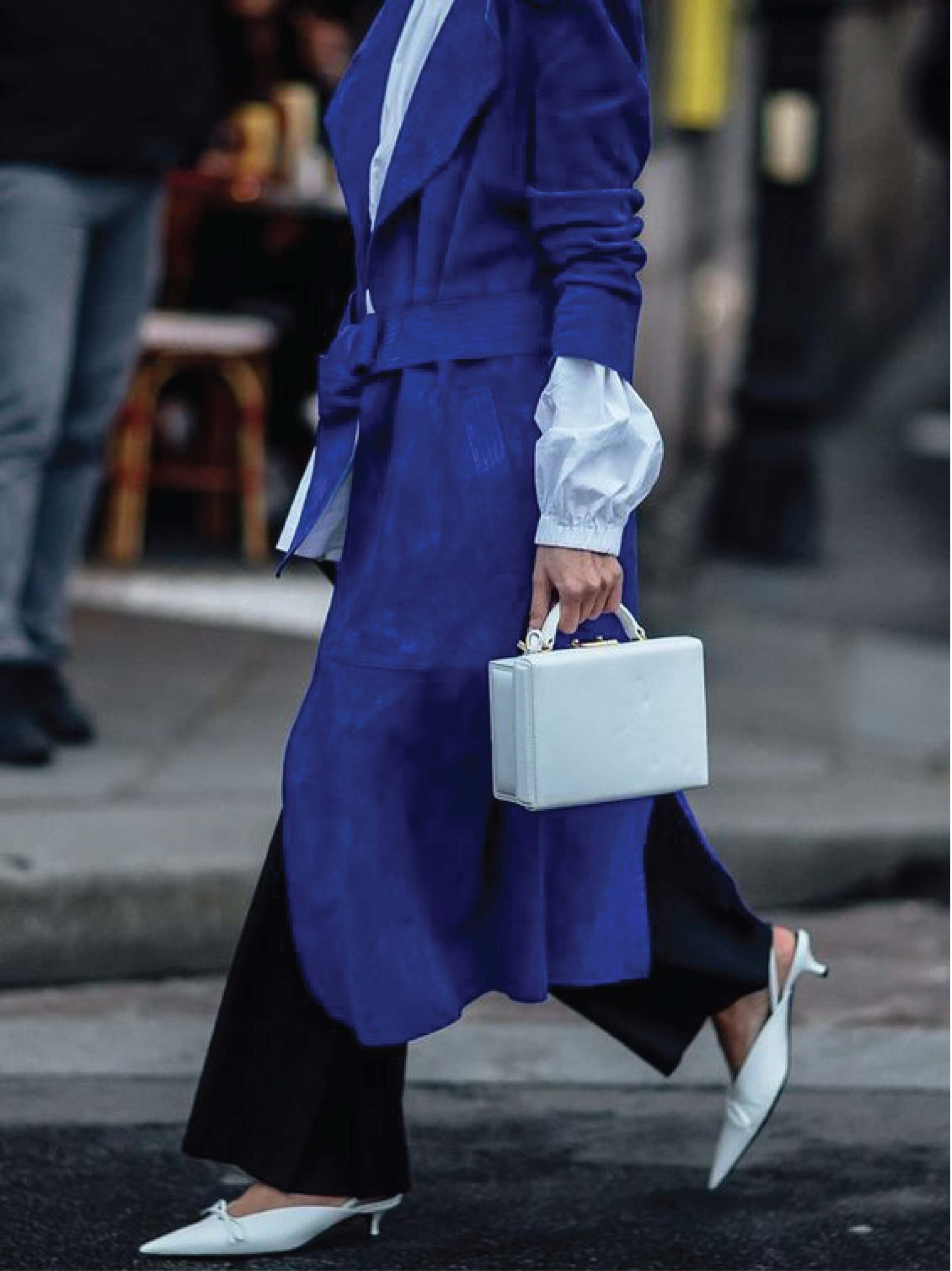
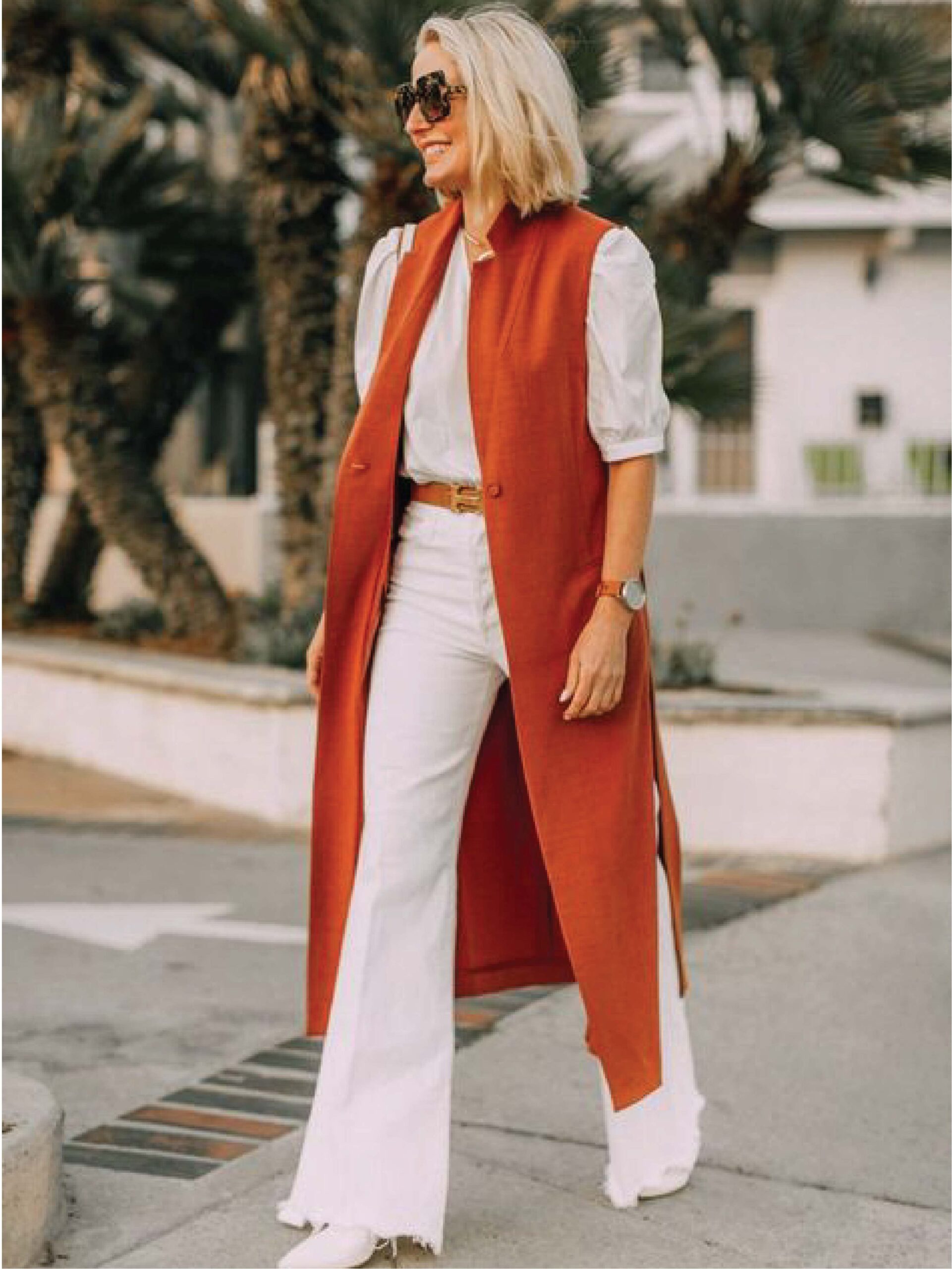
Rust
1
2
3
4
5
6
7
Previous
Next
When it comes to this colour rust, you can relate to the leaves in Autumn. People who often wear rust colour are perceived as reliable, honest and stable. This earth inspired brown is very easy to match and often is a safe colour to shop when people are run out of idea what colour to put on next. So, let’s start by identifying the colour!
(Pic 1 - 5) You look better in colours like burnt orange, teal, warm brown and mustard yellow? Then rust is for you too! You can wear rust colour with monochromatic style different texture, or pair it with your favourite heels or boots, maximum three colours. The examples from the pictures above: Rust & Light Grey, Rust & Light Brown & Black, Rust & White, Rust & Navy Blue & Black.
(Pic 6 - 7) You may also pair it with the combinations above: Rust & Eggplant, Rust & Cobalt, Rust & Mustard, Rust & Seafoam, Rust & Indigo, Rust & Emerald or Rust & Neutral Colours (White & Black & Grey). Have fun matching!
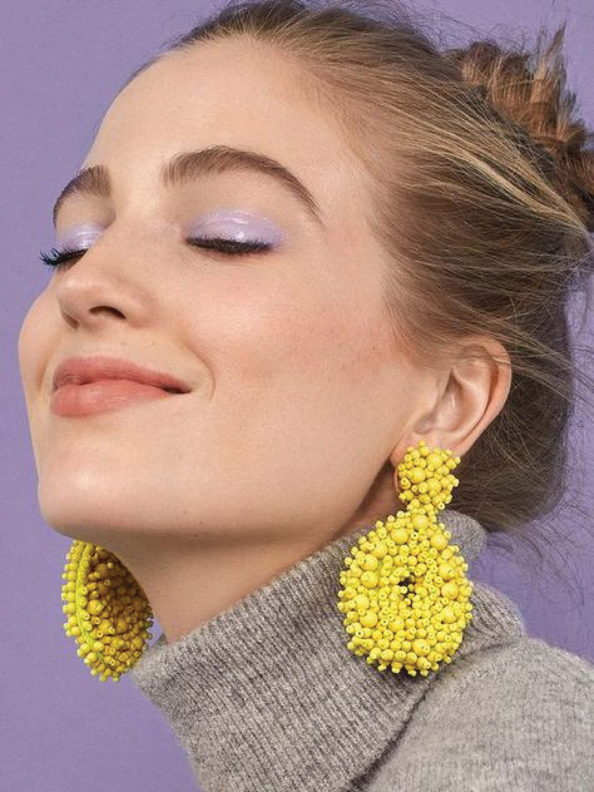
Illuminating
Is this the colour you would first avoid when it comes to outfit? Me too, before I studied image consulting. But now? I absolutely love this warm tone -- Illuminating! This is the colour of sunshine, happiness & creativity.
1
2
3
4
5
Previous
Next
After 12 colour seasons analysis, I am categorized in a cooler tone family. Even though I love Illuminating colour so much, I wouldn’t be able to place this colour close to my face or else I look very tired. So how can cooler skin undertone people like me style this colour? Put on a warmer tone foundation and blusher, do a colour block light purple eyeliner and style it with bright yellow earrings! Not a fan of earrings? Try prints, dress contrast or dress colourful! More ideas? Go for a pair of fun socks, fun shoes!
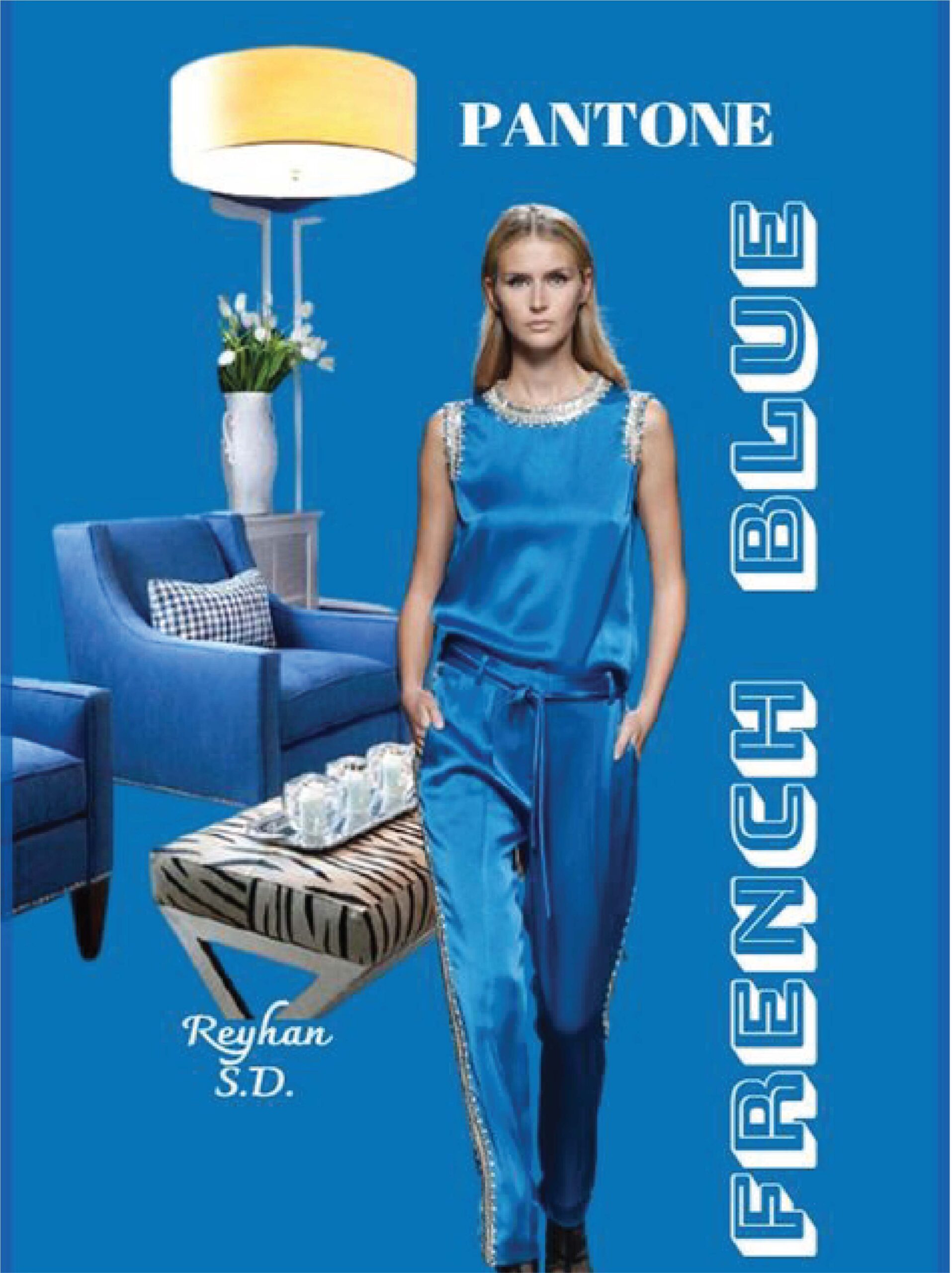
French Blue
1
2
3
4
5
Previous
Next
There are many shades of blue range from cyan, turquoise, maya blue to sapphire, persian blue and midnight blue. So what are the differences between Cerulean Blue and French Blue? The common characteristic of these two colours is they both are blue. The differences are french blue is cooler and darker than cerulean. You can style this colour to create a romantic look, creative look, classic look or bohemian look as you like. Examples are as above:
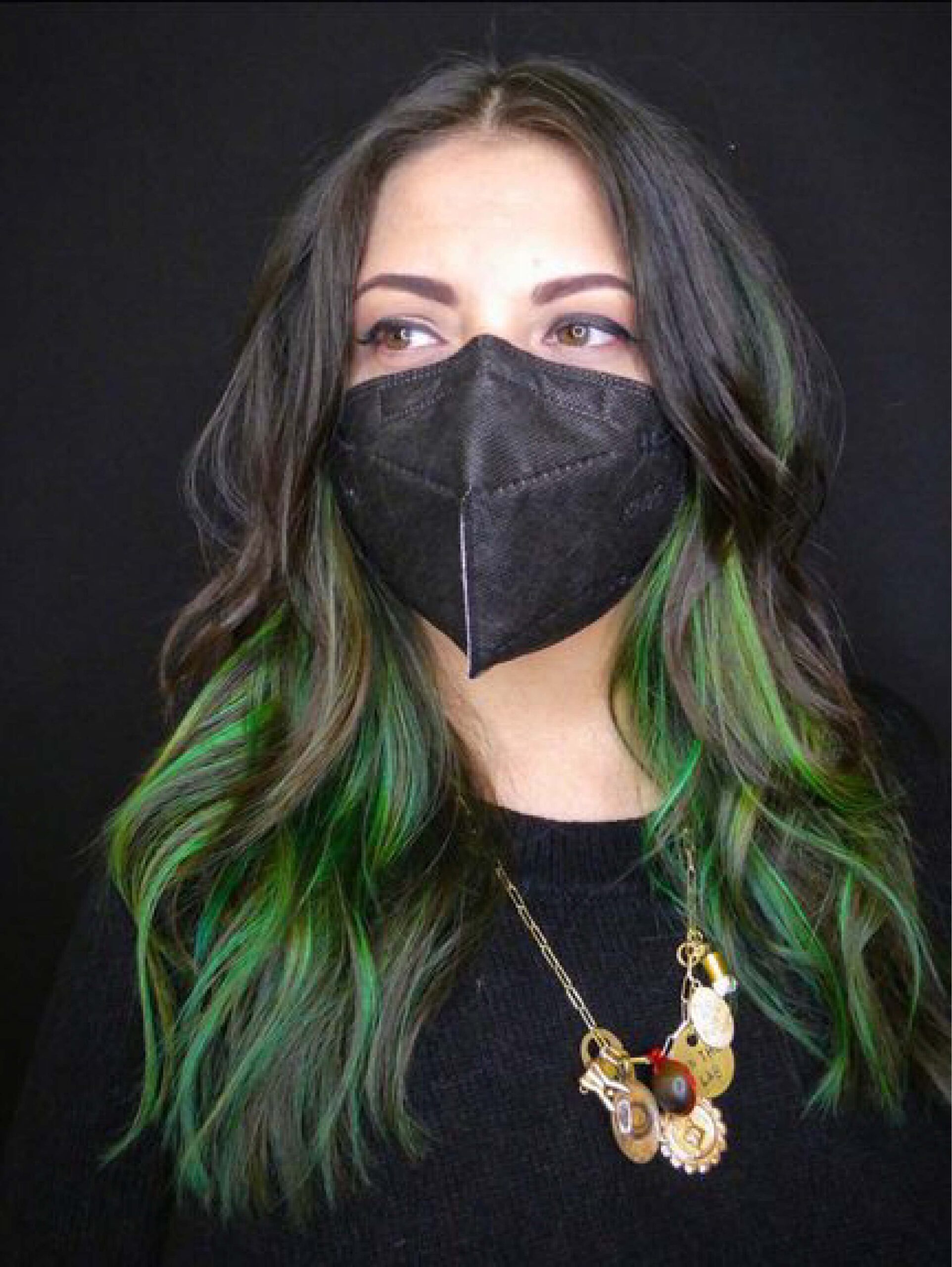
Green Ash
1
2
3
4
5
6
Previous
Next
We see green ash colours everywhere in nature. People are getting creative to use the colour of nature and put it into foods like macaroons to create that coolness and soothes effect. Darker green and neutral colours like white, black and cream colour are great colour combinations for the next nail and hair colour. You can find this cooler green colour -- green ash in both fashion wear & cultural costume too!
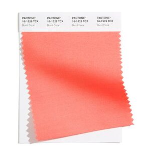
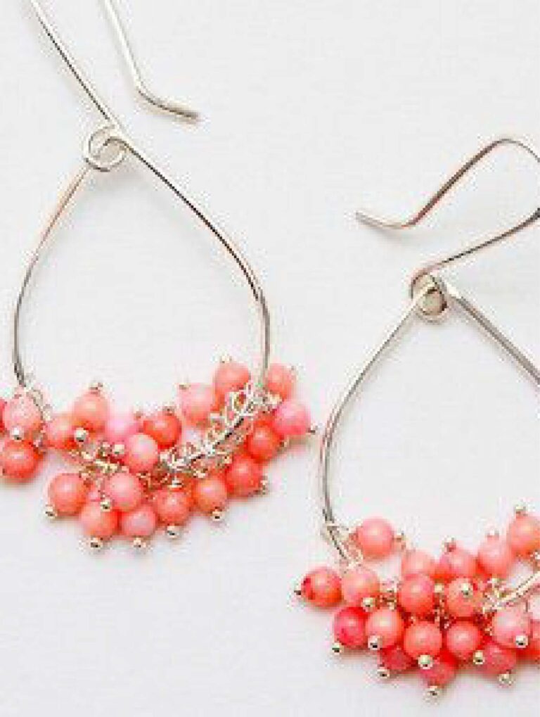
Burnt Coral
1
2
3
4
5
Previous
Next
Pantone describes this colour as “Inviting Burnt Coral expresses conviviality”. Look at these beautiful pieces!
Often this slightly warm colour is perceived as feminine and true enough, Burnt Coral on flowy material and lace pattern showcases the feminine side of the wearer. Putting burnt coral colour top with blue jeans, accessorize with black jewelries, or use it as a jacket or wear it as a monochrome outfit are all great combinations. Important note here, in order to not feel like trying too hard, go for burnt coral bags or shoes with a basic colour outfit.
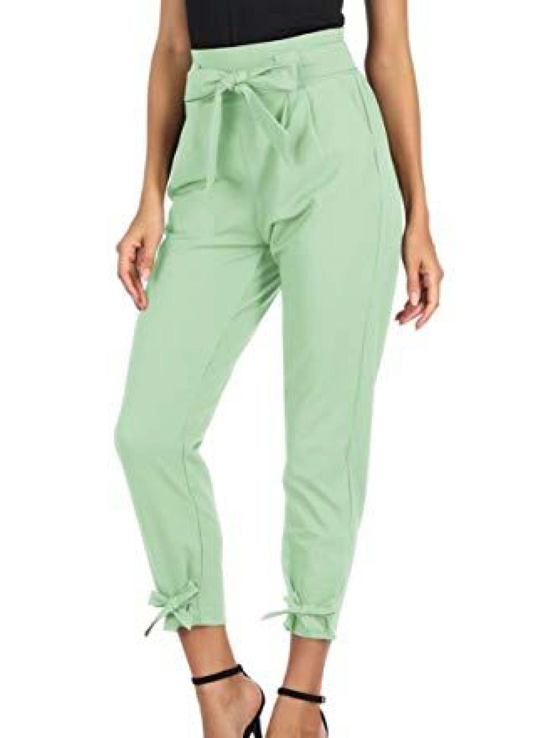
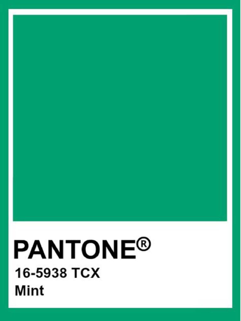
Mint
1
2
3
4
5
6
Previous
Next
Matching with a black pouch, layer with gold necklace, or wearing red heels and earrings helps make the colour pop. Safe choice? Black and white. That’s how Queen Letizia matches. Any colour block can be done? Check out from the pictures above!
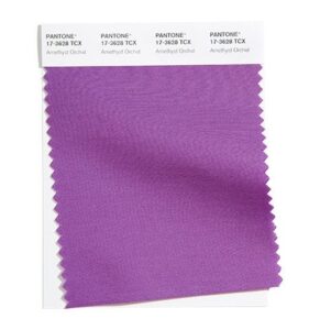
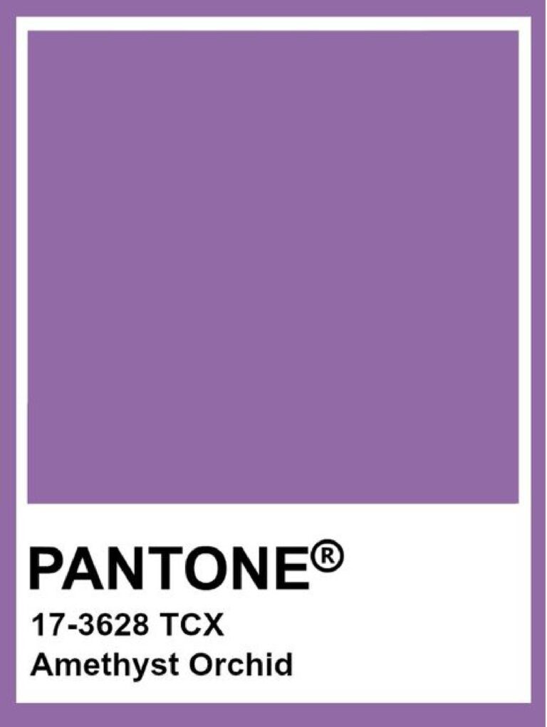
Amethyst Orchid
1
2
3
Previous
Next
Purple colour is often associated with royalty, wisdom and mystery. It reminds us how this colour has a unique touch among the greens. Amethyst Orchid has a warmer purple, whether you are pairing it with darker purple, silver, teal, black or red, it's' all good to go!
Raspberry Sorbet
1
2
3
5
6
7
Previous
Next
This cool dark pink looks perfect on people with cooler skin undertone. You can style this colour as a top with black skirt, knitwear with washed jeans, jacket on top of plain white tee, or dress monochromatic with a detailing as design. If you are warmer skin undertone, pair this colour as your bottoms like pencil skirt or biker short looks awesome too!
Color palette for raspberry sorbet? Check out the pictures above!
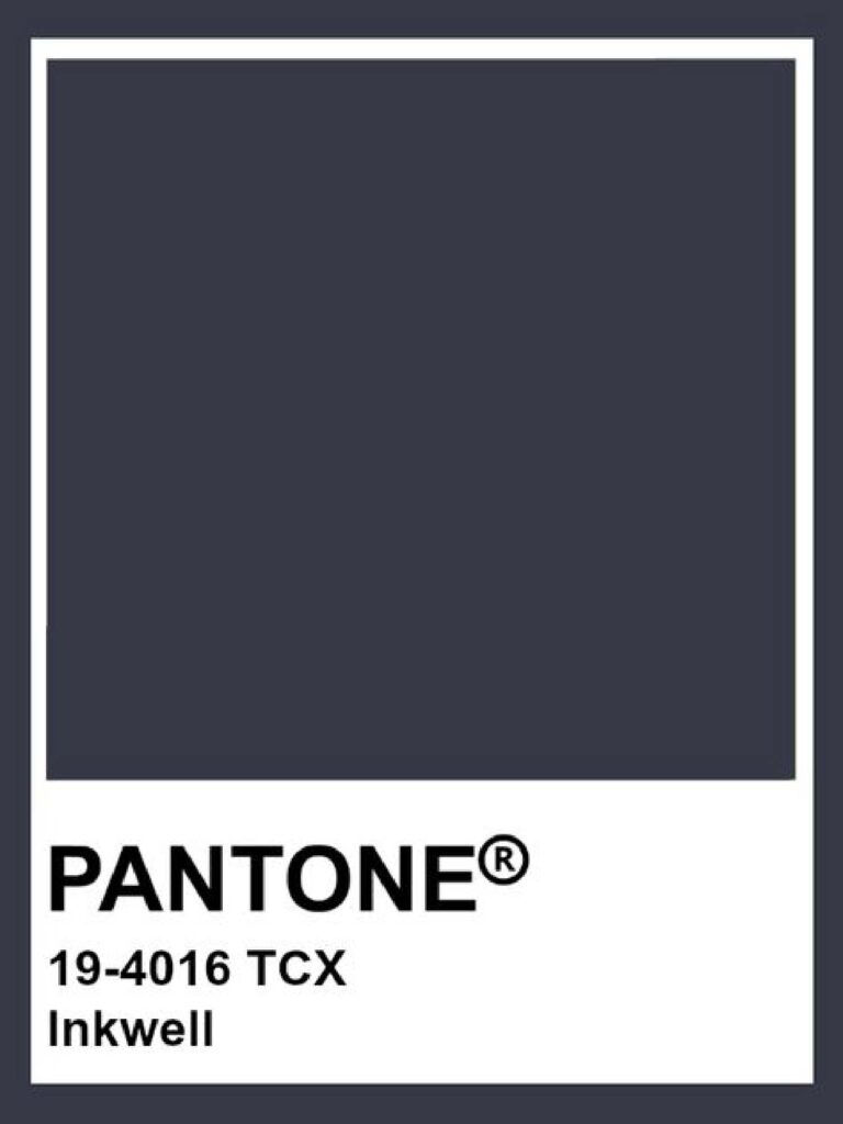
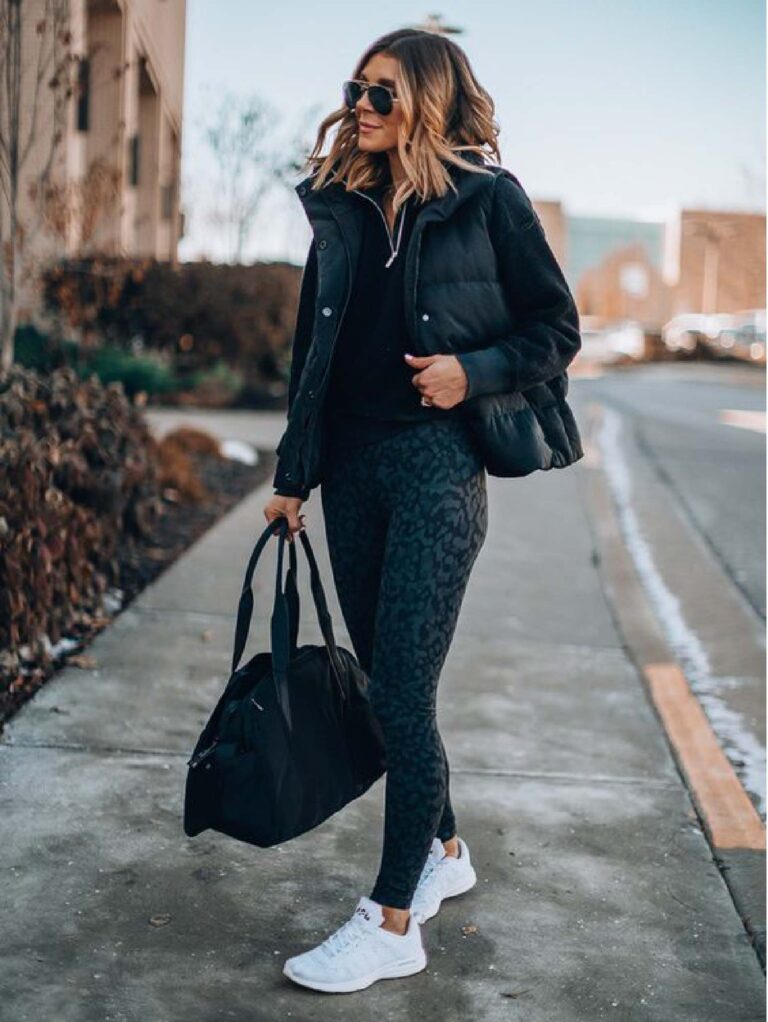
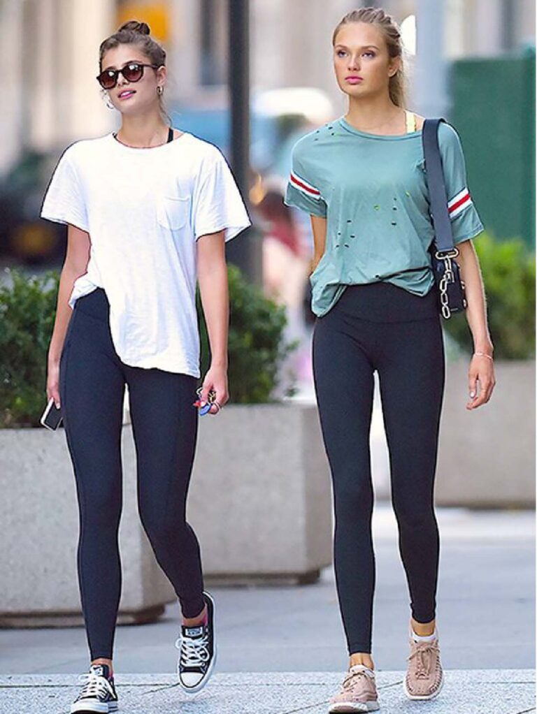
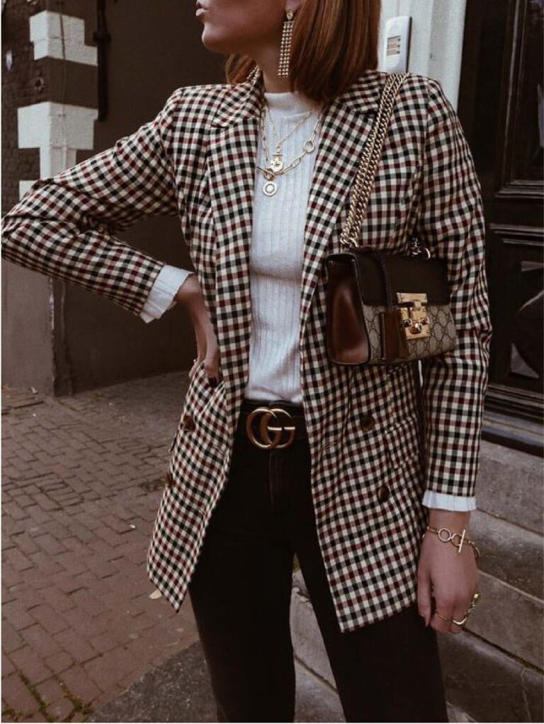
Inkwell
1
2
3
4
5
6
7
Previous
Next
Inkwell is a classic navy blue colour added magenta into it to appear more cool. It appears almost like black and therefore is so easy to match. Inkwell is a perfect colour for your leather jacket, sports wear, your everyday bag, sunglasses frame, belt, anything that you want to put it on. Is definitely one of the basic colours that would not go out of style!
Ultimate Grey
1
2
3
4
5
Previous
Next
Grey is described as classic, conservative and formal. Many formal workwears include grey, grey suit, grey dress, grey skirt etc. Anyone can look great in grey since it is a neutral colour, thus you see varieties of grey in business casual, casual and traditional wear too. Moreover, grey can match many colours from neon yellow, navy blue, purple, with neutral colours too!
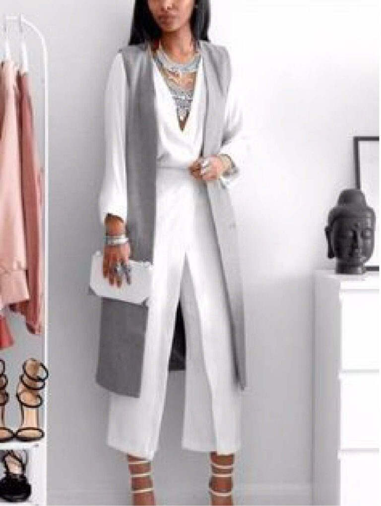
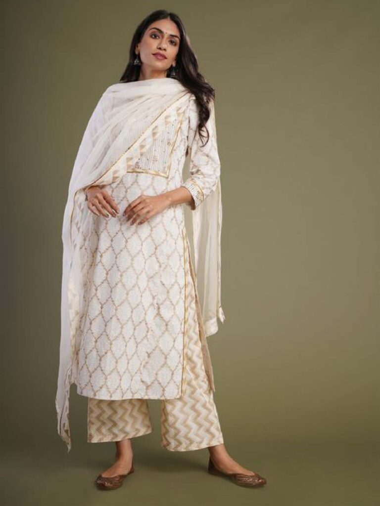
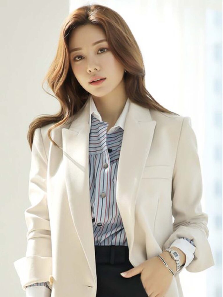
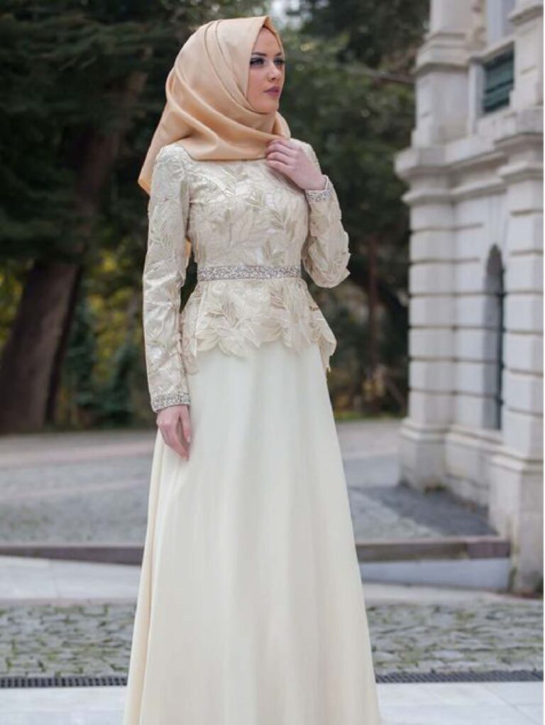
Buttercream
1
7
3
4
5
Previous
Next
Buttercream is an off white colour which colour consultants categorize this colour to be a warmer category. Similar to white, this is a colour that matches a lot of other colours which results in massive usage in the textile industry. Picture shows buttercream colour from working attire, casual attire to cultural attire and accessories.
Desert Mist
1
2
3
4
5
Previous
Next
Beautiful colour desert mist looks exactly like the desert colour. A lighter brown that can pair with neutral colours, blues, make it as a print, polka dot or checks, it all looks good and blends well. This friendly colour draws people closer to have a chat. Pictures below show how to style it casually, sportly, trendy and chic look. Enjoy!
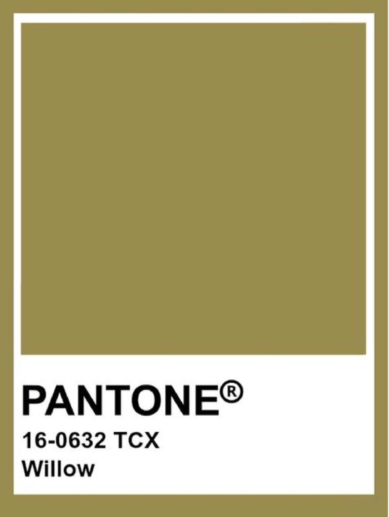
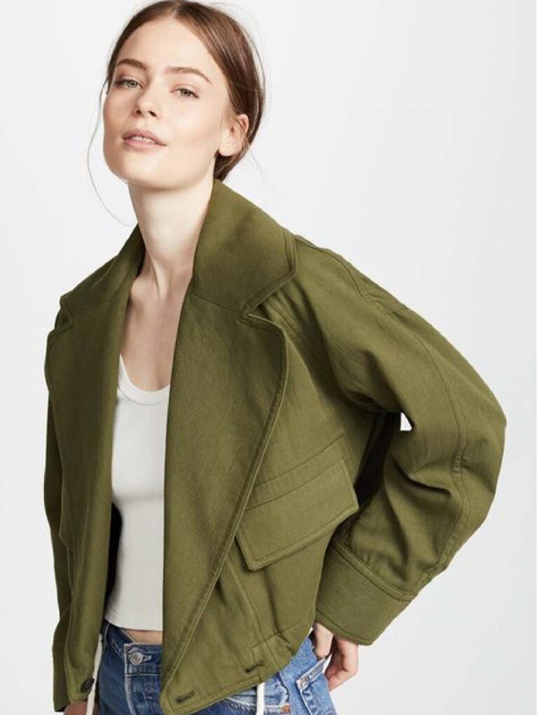
Willow
1
2
3
4
Previous
Next
Almost like the colour of forest, willow has a yellow tone that adds some warmth into it and looks like an army green service uniform. People who have warmer skin undertone would look really good with willow. This colour is not popular yet but let’s see some pictures to have a better idea!